Ardem Wiki Branding
Official brand assets and guidelines for the Ardem Wiki. Use these resources to correctly represent our brand in your content.
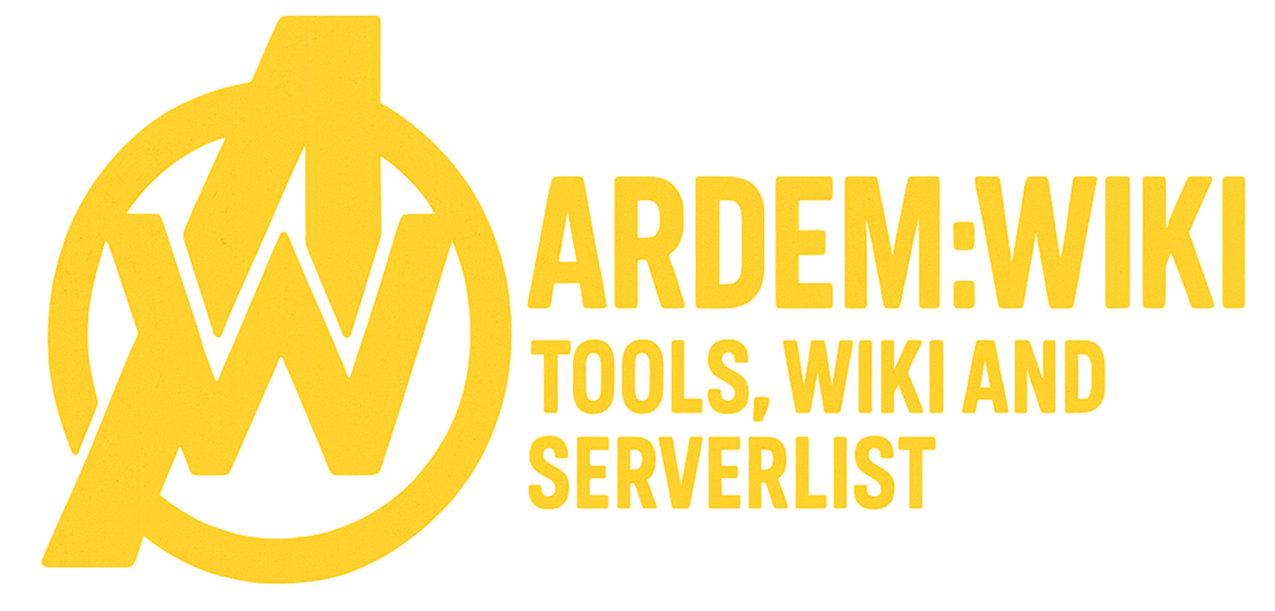
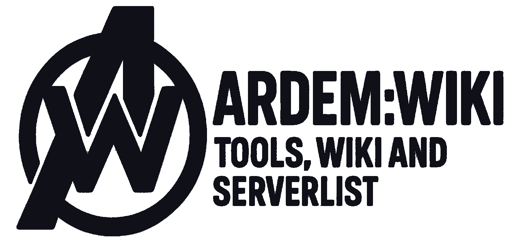
Logo Assets
Our logo is available in several variations to suit different backgrounds and use cases. Click on any logo to download.


Logo Usage License
The Ardem Wiki logo and all related brand assets are the property of Ardem Wiki. Permission is granted to use these assets for the purpose of linking to or promoting Ardem Wiki, provided that the assets are not modified in any way (including but not limited to changing colors, proportions, or elements). The assets may not be used in a way that suggests endorsement or affiliation without explicit permission. For commercial use or any questions regarding usage, please contact us.
Color Palette
Our brand colors establish the visual identity of Ardem Wiki. Use these colors consistently across all materials.
Primary Yellow
Main brand color, used for important elements, headings, and accents.
Dark Background 1
Primary dark background color, used in gradients and dark UI elements.
Dark Background 2
Secondary dark background color, used in gradients and as alternate dark UI elements.
Discord Purple
Used for Discord-related elements and accents.
Light Gray
Used for secondary text and subtle UI elements on dark backgrounds.
Typography
Consistent typography helps maintain our brand identity. Use these fonts across all Ardem Wiki materials.
Inter
Primary Font
Used for all body text, navigation, and general UI elements.
The quick brown fox jumps over the lazy dog.
Poppins
Heading Font
Used for headings, titles, and emphasis text.
ARDEM WIKI TYPOGRAPHY
Logo Spacing Guidelines
Clear Space
Always maintain adequate clear space around the logo to ensure visibility and impact. The minimum clear space is equal to the height of the "A" in the Ardem logo.
This clear space should be maintained around all sides of the logo, regardless of the logo variation being used.
Do's
- Use the provided logo files without modification
- Maintain clear space around the logo
- Use the light background variant on light backgrounds
- Use the dark background variant on dark backgrounds
- Scale the logo proportionally
Don'ts
- Alter the colors of the logo
- Distort or stretch the logo
- Add effects like shadows or glows to the logo
- Place the logo on busy backgrounds that reduce visibility
- Rotate or skew the logo